John Smith
You have 4 new messages
You have 4 new messages
Own up: you are one of those mobile device users who abandons a website and doesn’t bother to go back to if you have to contend with jumping content and misclicks while the page is loading. It is definitely not a good experience, especially when pages suddenly move and we lose what we were reading, or when we try to click on a button, but a pop-up appears instead, unintentionally redirecting us to unwanted pages. These are two annoying examples of layout shifts. These are simply shifts in the layout of web pages that can cause difficulties in the user experience.
[divilifeshortcode id=’9530′]
Fear not- you are by no means the only one. On the contrary, according to the findings of Chrome User Experience, which takes the real browsing experience of browser users into account, you belong to most internet users.

It is no coincidence that this aspect, which Google calls the visual stability of webpage elements, Cumulative Layout Shift (CLS), is considered by the search engine to be a decisive factor regarding the quality of the user experience on the web in conjunction with loading speed (Largest Paintful Content) and responsiveness (First Input Delay FID). This is so much so that the Google Page Experience Update places these three essential Core Web Vital parameters on a par and considers each individual one as a fundamental ranking factor for SERPS. They therefore strongly impact SEO and conversion strategies.
Before taking a closer look at CLS, let’s run through the new core web vital metrics introduced by Google in May 2021. The Three Musketeers established by the new Google Page Experience algorithm for a good UX are as follows:
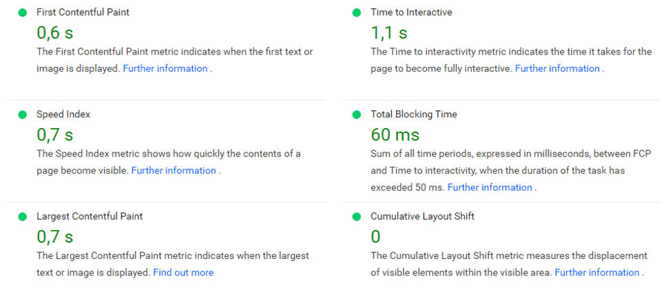
Not only do these three metrics allow for an accurate and objective analysis of the quality of a site’s navigation and its ability to interact with the user, but they also offer an extraordinary range of possible interventions so as to limit delays and difficulties for users. It is a win-win situation for everyone involved: users can enjoy a good internet experience and access data and media quickly and efficiently while website owners can see bounce rates reduce by 70% and conversion rates rise by 12% thanks to just a one-second decrease in page loading time.
Google thrives on web content and so awards sites for making access to it easy, fast and pleasant for users with high-ranking positions in its search engine results.
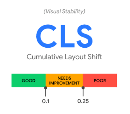
Cumulative Layout Shift (CLS) is a metric that measure the visual stability of websites. Crucially, the Cumulative Layout Shift assesses the stability of the interface and aims at minimizing one of the most common and annoying experiences faced by users when navigating a site from a smart phone or desktop: the unexpected shift of elements on a page during loading. This sudden change in layout occurs when a user goes onto a page to access text and notices changes in page structure. Generally, text moves but it is also quite common for videos, images, a button or a contact form to do this too. Sometimes, even an advertising banner may appear without warning on the main page. These unexpected upward and downward content shifts with resulting changes in layout worsen content usability be it media or text, thus compromising the overall quality of site navigation. In addition, these shifts often generate possible errors driven by the user who may try to overcome the problem by clicking on links or buttons thus causing further delays to the detriment of a good browsing experience. Visual stability shortcomings, a particularly common trait on mobile devices, are no longer forgiven by Google.
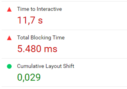
But how is visual stability calculated? Although CLS is very intuitive in its effects, it is perhaps the most complicated of the three web essentials to measure. For a better understanding of how it works, we need to ask why these layout changes occur in the first place: put simply, it is a question of space. While LCP and FID are a matter of time calculated in seconds and milliseconds, CLS is a matter of space calculated as a percentage of the surface of the occupied viewport by elements during webpage loading.
If the space is not optimized to accommodate the various elements, the browser will change the position of the content to find space for all of the elements. This in turn affects page layout. Thus, Google Page Experience calculates the number of unexpected shifts occurring per surface area and cumulates the data between them. The site web.dev defines Cumulative Shift Layout as: “CLS measures the sum total of all individual layout shift scores for every unexpected layout shift that occurs during the entire lifespan of the page.”
Therefore, the bigger the element and the more the unstable element shifts, the poorer the navigating quality of the site.
Two factors, impact and distance, or rather, Impact fraction and Distance fraction, must be measured and multiplied by each other to calculate the layout shift score.
Impact = the dimensions of the area occupied by an unstable visual element on the viewport. For example, if a text takes up 50% of the viewport and moves vertically by 25%, the total area occupied by this element will be equal to 75% of the window.Distance =the distance this unstable element has moved in width or height relative to the viewport. Based on the above example, it will shift by 25%.
The product of the two factors must be less than 0.1, the optimal index threshold set out by Google. If the element cumulatively occupies 75% of the viewport and shifts by 25% as seen in our example above, the Layout Shift Score, which measures Cumulative Layout Shift will be 0.1875% over the Google threshold for best results. Google suggests analyzing at least the 75th percentile of page loads segmented across mobile and desktop to achieve the optimal threshold. If a site scores an index equal to or less than 0.1 in three-quarters of cases analyzed, no improvements are necessary. Instead, if the score is above 0.1, the site needs to be optimized.
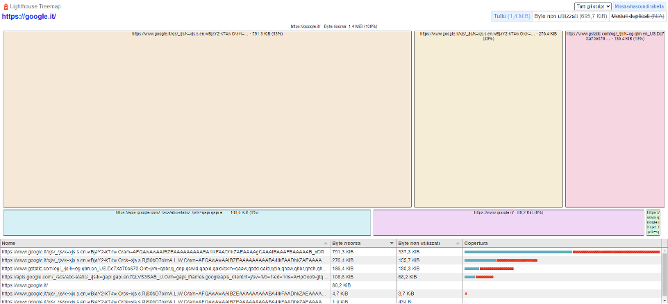
Verifying and measuring stability layout on a webpage or a whole website can be carried out using various measurement tools in the lab and in the field. Both are recommended to guarantee a more accurate analysis of the site’s behavior and help pinpoint the areas in need of improvement before release.
Useable tools are as follows:
Warning: Only unexpected changes in layout are to be considered as dangerous and not those intentional ones determined by interaction between a user and the page elements. On the contrary, in this case, the faster the change, the better both the user experience and the First Impact Delay score.

It will therefore only be necessary to intervene in sudden and unexpected changes. But how? Google Dev suggests trying some of the following operations to bring about improvements and optimization for visual stability:
Nevertheless, these are partial interventions which only impact one of the Web Core Vitals and so individually, they are not enough to optimize website performance as a whole to improve UX and ultimately impact positively on ranking and SEO.
The adoption of best practices would make it possible to avoid unexpected layout changes and thus improve the User Experience. As we know, ensuring a satisfactory experience is equivalent to achieving the objectives set for the success of our online projects, which can be encapsulated in three main aspects: ranking, traffic and conversions.
(https://www.notonlyseo.com/blog/seo/come-ottimizzare-il-cumulative-layout-shift/).
A more comprehensive approach towards the issue of optimizing website performances can be directly tackled using a tool like the iSmartFrame. This is a layer which works with a proprietary cache solution to absorb every critical issue a site can present with in relation to Google metrics without having to intervene with codes and programming language. In fact, it is positioned between the browser and the original CMS and optimizes not only visual stability, but also page loading and interaction time, contributing to the success of marketing strategies such as SEO projects and improves ranking for SERP.
But most importantly, this layer gives a good hand in transforming a disappointing user experience into a positive one. Ultimately, it is a winner for improving conversions and therefore the final value of the contents inside the user’s cart.


